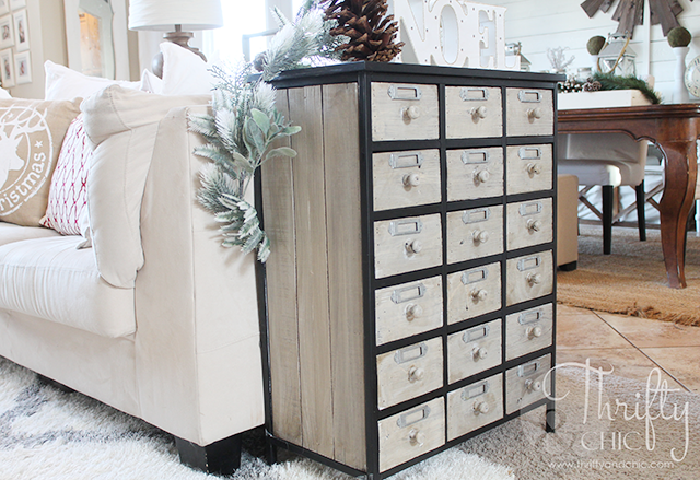
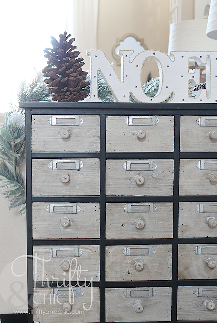
As many of you probably can figure, I like my house pretty bright and neutral...and mainly white :) So, when I found this card catalog, I immediately fell in love, but really hated how dark it was. I actually didn't have too much of a problem with it at first. I just loved the piece despite it's faults :) But, as the months have passed, I just couldn't leave well enough alone and had to paint it. I know, I know. Most people would probably kick my butt for doing so, but I had to. It just looked like an eyesore in our house.
So, today, it now looks like this.
It fits my color scheme so much better!
So, at first, I thought white washing it was the way to go. So, I taped off the metal and started at it.
I then started to realize what a mistake I had made. I shouldn't have painted it! But, I was already in head deep so I had to keep going. But the white...ugh. It just looked horrific.
So, I decided I needed to rub a quick stain across it. I used Dark Walnut by Minwax.
And...well, it turned out perfect! Just the way I envisioned it. It's like the perfect greyish white-brown.
I wanted to change out the hardware too. But the current knobs are all stapled in. Which, I totally could have undone, but then I realized that I would need 18 new knobs...and well, that just got a whole lot more expensive :) So, I kept them the way they were.
It feels great to get that big brown blob out of the room! I really did love it before, don't get me wrong, it just wasn't for this space :) Stay tuned for next week when I share more of this room during part 2 of my Christmas home tour!
Oh yeah, and FYI, I got this card catalog from Hobby Lobby for about $100! Go get one if you've been dreaming of one forever like I was :)


I LOVE it!! I really want one for our home office. How is it for actual storage?
ReplyDeleteIt looks great!
ReplyDeleteI loved it before, Alicia, but I love it even more now. What do you keep in those drawers? Like Susan, I want to know what could go in there... I have always loved how these look.
ReplyDelete