My living room has seen a little bit of a transformation within the past month, which I shared with you on my Fall home tour (check it out here if you missed it). Today, I just wanted to share with you a little before and after of the board and batten, and a little snippet of how I did it. I've done so many board and batten tutorials in the past, I figure another full one isn't that necessary :)
I have a vision to see board and batten go half way up my full two walls in our living room, but am seriously being a chicken butt and not getting it done. I have wanted to do this for like 4 years now. It's just that if I screw it up, I can't just paint over it...I literally have to repaint two 20 foot walls. I know I could always match the paint, but in my many experiences in the past, it is very hard to completely mesh them together to make in seamless. So, anyway. This was my first step. I knew I wanted two corner walls in here a shorter board and batten, and I figure those would be easy to repaint if necessary, and truthfully, it wasn't a huge project like the other two full walls would be ;)
The picture above and the one below are the two walls I decided to do first.
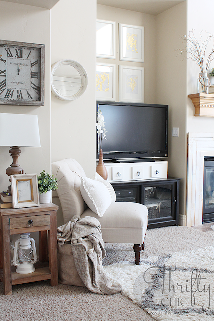
I actually really loved this little corner before the board and batten, but my chair matched the color of the wall almost perfectly and it drove me nuts :) haha. So, instead of changing out the chair, I decided to paint the wall.
And after:
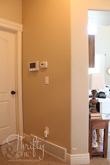
This wall goes into a little hallway that has no natural light and is always so dark. I knew I wanted to brighten this space up for years, and this was the perfect way to do it. Here's the before:
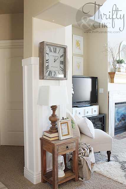
And the after:
I tried the best I could to keep the slats about 11 inches apart, even around the corners. But it did fluctuate from 10 to 12 inches to keep the slats centered on the front of the column and to work around the thermostat and alarm system. But really, you can't even tell :) You can see from this angle the color of the chair and the beige wall are pretty much the same.
So, at least on this side of the wall it stands out. Eventually when I get enough courage to paint the other wall, that won't be a problem.
Here's another before:
And the after, which you can barely tell :) But, the wall with the TV on it and alcove will be the one with the new board and batten on it. I want to stop it about a few inches above the top of the alcove. Then I have to figure out what to do with the alcove, and the other one on the opposite side, and the fireplace....see, this is why I still haven't done it :) Can't decide!
As for the other little board and batten addition to the living room...here's the before of this wall:
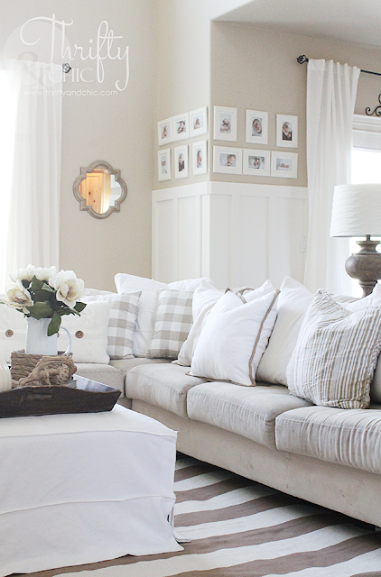
And the after:
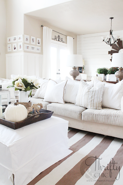
This is the one wall I wanted to do the most to brighten up the space and to get rid of the blend of my couch into the wall. Once again, they were practically the same color. I also wanted to have a better transition of the wall from the living room into the dining room and this did it.
I did have to get rid of my long mirror which I loved, and I'm still getting used to not having it there. But, I couldn't be happier with the way this turned out.
I was concerned about how the board and batten and shiplap would mix, but this totally works. I love it!
As for my small little tutorial, in case you were interested. Here's how I did it. I used 1x4 primed mdf boards for the slats and 1x6 for the top. I marked where I wanted the top to sit first, making sure it was level and painted below that.
I then cut the top pieces to fit. Working around the rounded corners were a pain, but when I figured out the angle, it was a little easier :) I made sure to cut the longer pieces long and trimmed from there until the middle little piece fit snugly. The angle I came to was 22.5 degrees.
To make it more rounded, I used some spackling compound to fill the seams, then sand the heck out of the corners. Once I painted them, they turned out perfect!
Next was adding the slats. I didn't take a picture of how I transitioned them into my existing molding, but you can see from the picture below, the angle I used was the same. It was 45 degrees. I did it on the switch plate also. Once this was painted, it was a pretty good transition and not an eyesore. Otherwise, I would have had to adjusted my last slat by like 3 inches to the left and that would have driven me more nuts having the slats not equidistant :)
And here's the after again. The wall with the windows will have (hopefully haha) board and batten to the mid section between the two windows. Now if I can only get up enough nerve to it! Seriously though, I'm so concerned it just won't look good and that I'll be ruining an already good thing :)
And just for fun, because I love a horrible before picture. This is how our living room looked the first few months when we had just moved in:
Same sectional! A little better condition probably haha. Obviously my style has changed and my love for pillows has only increased exponentially :)
Subscribe to:
Post Comments (Atom)








Oh I love it. It looks amazing.
ReplyDeleteSimply beautiful home.
ReplyDeleteYour home looks like something from a magazine! beautiful but still lived in and inviting. a great mix of colours and textures.
ReplyDelete