Sometimes you have to embrace things, and not change things. My kitchen is one of those tales. I rarely show it on my blog, mainly because it's not my aesthetic and it's the one area in my house I'm not necessarily proud of. It's the one area that I truthfully don't feel good putting my stamp on it either. I don't know why, it just makes me sick to think about painting these beautiful cabinets. Yes, I would love a kitchen full of white beautiful cabinets and amazing quartz counter tops. But, would I paint these to achieve that look? Well, if the answer was yes, that would have happened years ago. Believe me, it's a thought that has crossed my mind on way too many occasions to count. I just can't do it.
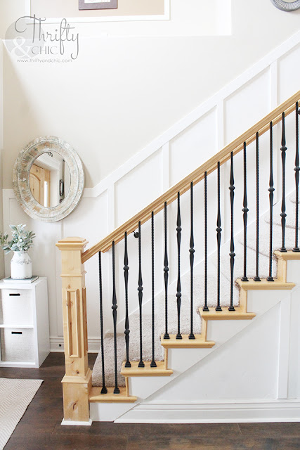
There was a time in my home that I wanted to paint all the knotty alder. Every. Single. Piece. I hated it. Luckily, I didn't. I have come to love my banister and my mantel along with my doors. I'm just still not sold on the cabinets :)
So, I'm going to share with you today how I'm embracing what I have and not changing something beautiful into something more my style. I'm also going to share with you at the bottom of the post some concepts on what I'm thinking about doing to update my kitchen without painting the cabinets.
See, since I'm not a big fan of my kitchen, I have not spent much thought on decorating it. I mean...it's a kitchen. What's there to decorate? And, I think that was my biggest mistake. I just used it. I was in and out. Cleaned it and left it. Hated it. I never put my mark on it. I realized this of course 10 years into living here. I know! I seriously have lived with it for that long :) ha! So, without any big changes (like the ones I'm thinking about below), I made steps in the right direction to start loving this area.
Here is the way before of my kitchen. Before I touched a thing. The cabinets, wall color and tile were all in the same hue....I called it a peach bomb. Serious, with the lights on at night, it looked like a huge peach bomb blew up in my kitchen.
Years ago, I realized that the knotty alder looks great against white, so I painted all the walls and ceiling white. This helped tame the peach bomb a tad....just a tad.
I then updated the island last year to help break up the peach. That helped a lot and let me put my stamp on this kitchen without painting all the cabinets.
I have lived with it like that ever since. Didn't really decorate. I mean, I did in odd little random ways. Like, oh, this needs a place. Let's put it in my kitchen. Other things had just been on my counters for years so I just left them there. No rhyme or reason.
My first step was to change out the curtains for something lighter and frilly...you know, to match the rest of the ruffles in my house :) I also switched out the light. This was a big step in the right direction. (sorry, the light is killing the view of my frills :) )
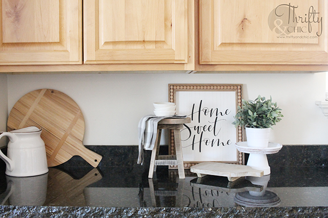
I got this sign as a gift from a sweet friend. I added my favorite little plant stand stool with a napkin draped over it along with some dipping bowls. I had to add some green with this faux potted plant. I then used two cutting boards out of my hoard....I mean collection....to finish it off :)
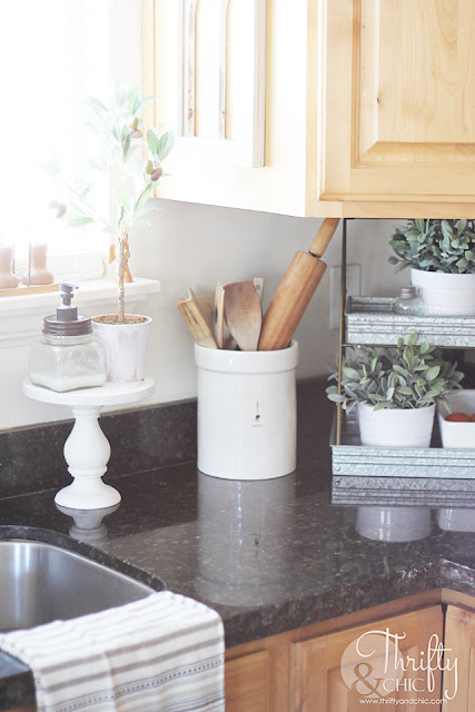
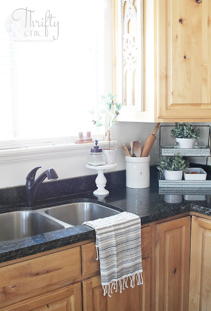
In this corner, I cleaned up the space by corralling all my wood utensils into two Rae Dunn canisters. I use this two tiered stand for fruits and veggies, but decided to decorate it a bit too with some faux greens.
I've been playing around with the placement of the stuff on my island. It usually sits in the middle, but I wanted to see how it would look on the corner, and I think I like it. It's great to have all that space on the island back. And it doesn't look too cluttered in the corner.
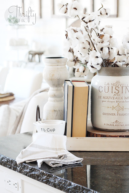
This little vignette is a collection of items on a tray.
I also added these amazing architectural piece I found from Hobby Lobby to the side of my cabinet by the sink. I think it adds a lot of character to the area.
In addition to this area of my kitchen, I have updated my only blank wall. We are in desperate need of a pantry...thank goodness my family is pretty small and we don't need that much room...yet. So, I bought this hutch to act as an extra little area for storage of food in the bottom and my collection on top.
It's my little mix of Rae Dunn and Hearth and Hand by Magnolia.
I love this view looking out of my kitchen into my living room.
Okay. Now are your ready for my ideas? And I would like you to weigh in with your opinion! I have three thoughts.
Here's my first idea. The simplest. What do you think about adding subway tile to this entire wall? ...oh, and look! You can totally see my curtains better with the mockup :) This curtain is totally a mockup too, but it's really what it looks like!
Third option, ditch the subway tile and use faux white brick.
In my opinion....I would like the 2nd option. My husband loathes subway tile...like seriously can't stand it. So, yeah. That's an uphill battle. He loves the brick idea, but don't you think cleaning brick would be a nightmare? Especially in the kitchen with all the grease, etc. And of course, the first one is so easy and would be quick to do with big impact! I am torn. Ha! What do you all like the best? Let me know in the comments below :)
Disclosure of Material Connection: Some of the links in the post above are “affiliate links.” This means if you click on the link and purchase the item, I will receive an affiliate commission. Regardless, I only recommend products or services I use personally and believe will add value to my readers. I am disclosing this in accordance with the Federal Trade Commission’s 16 CFR, Part 255: “Guides Concerning the Use of Endorsements and Testimonials in Advertising.”








0 comments